Cherry Street Energy
As a mission-driven power company, Cherry Street is focused on helping institutions reach ambitious carbon reduction targets and sustainability goals. As they approached a crucial moment for the growth of their business, a brand identity refresh was vital for Cherry Street to continue scaling. With aspirations to become an authority in the green energy market, their identity needed to be consistent and clear while speaking to a wide range of audiences.
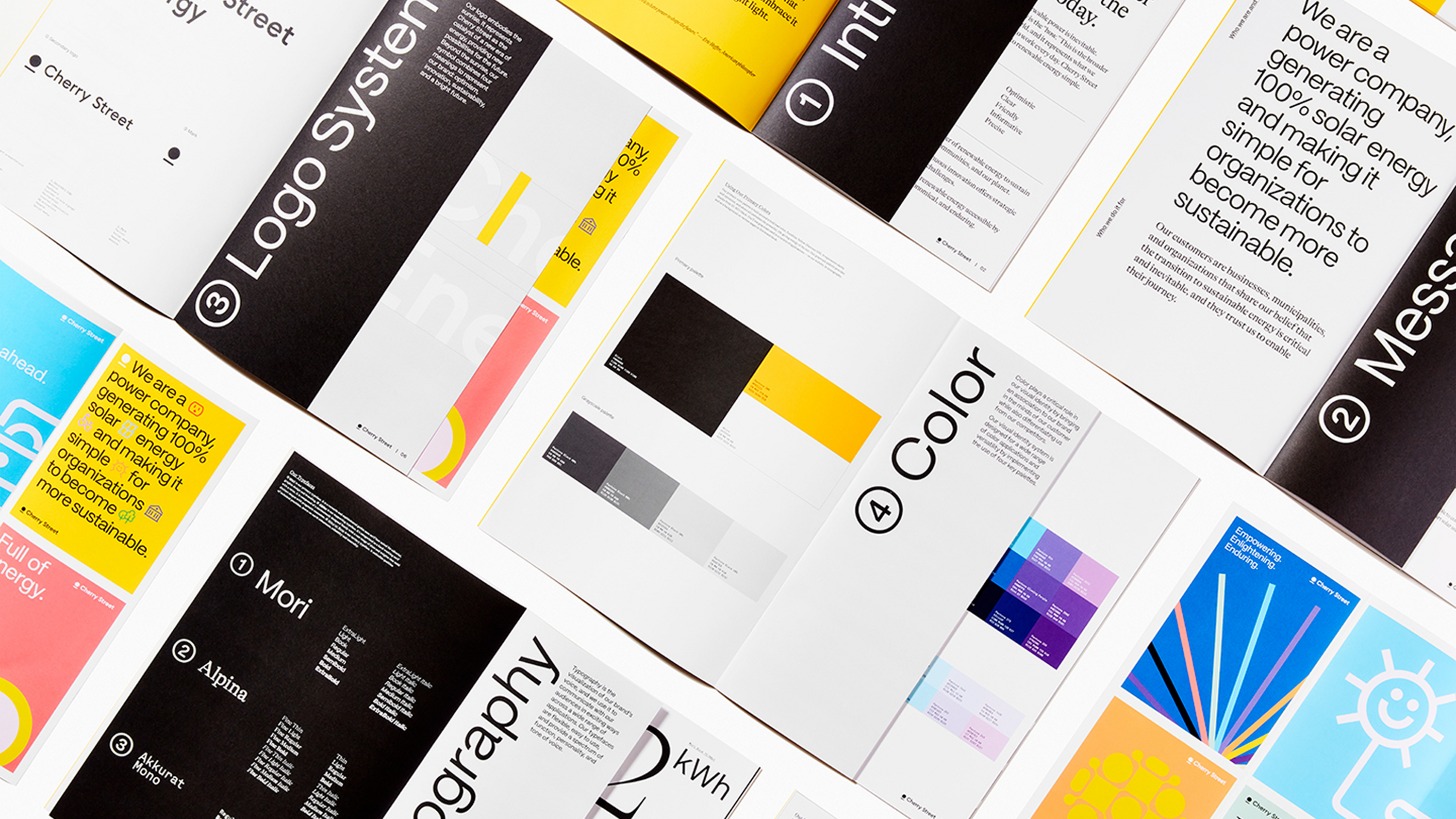
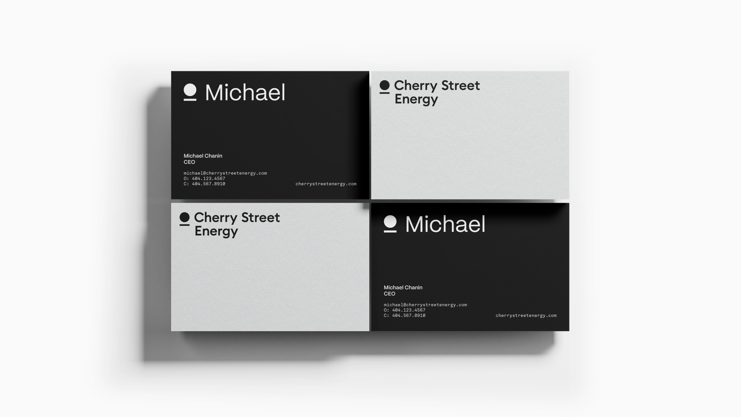
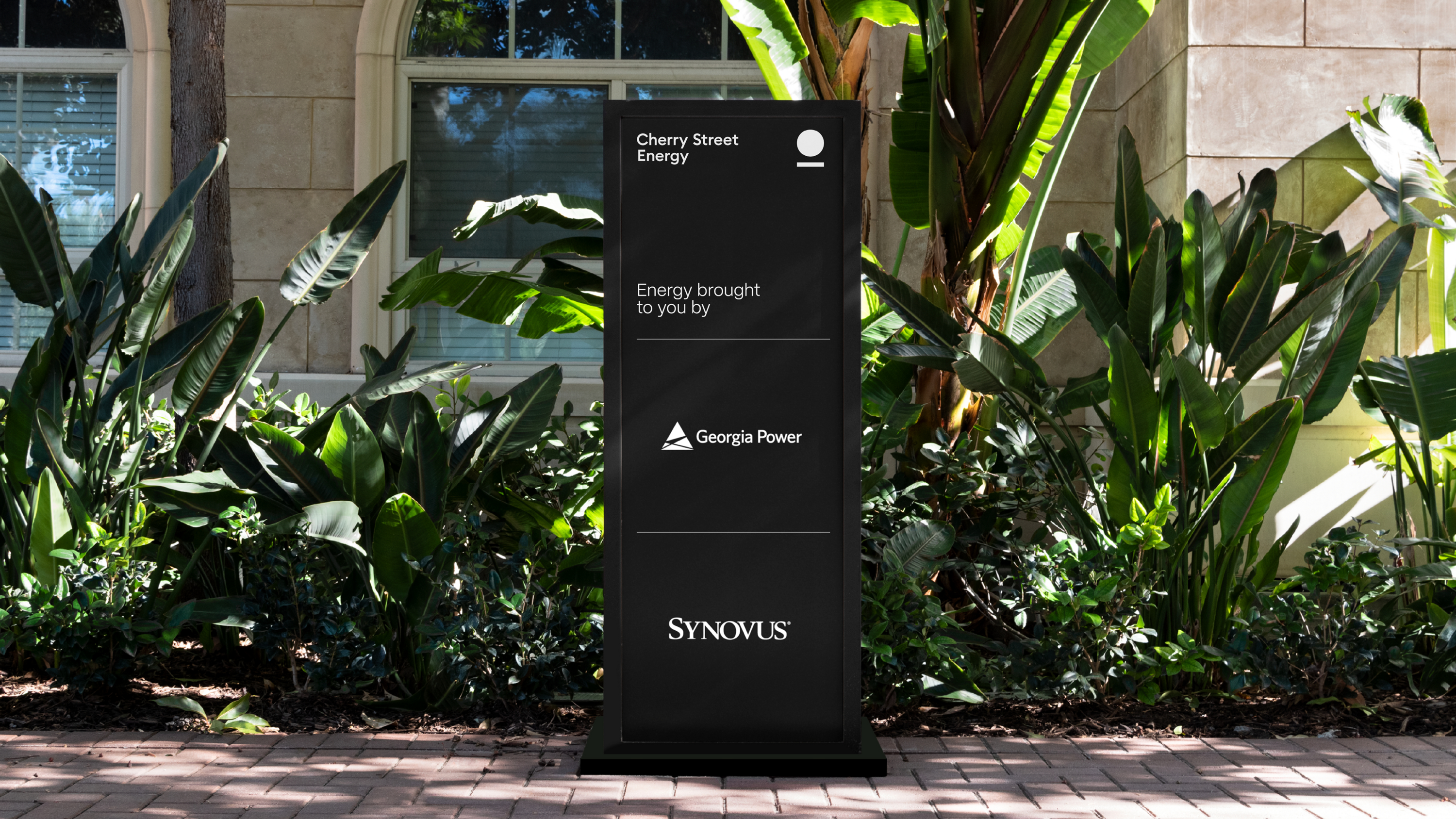
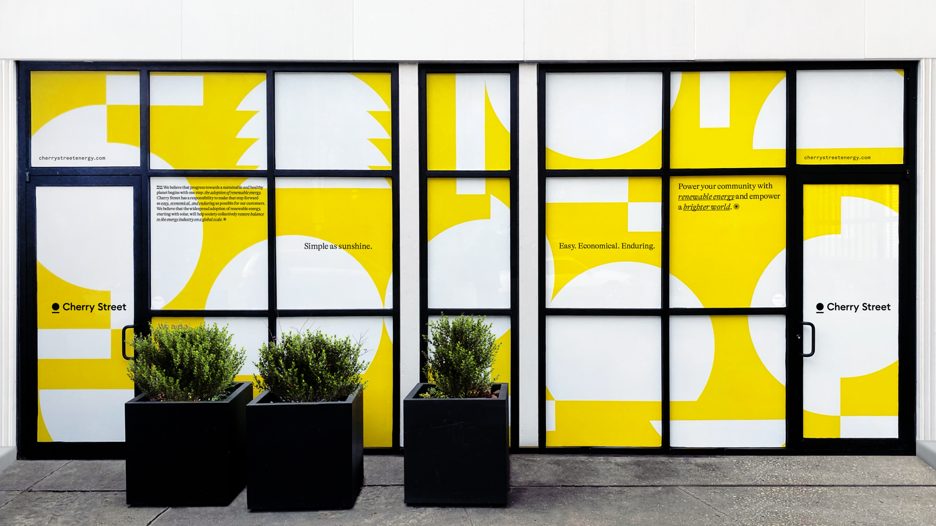
IfThen refreshed Cherry Street Energy's brand identity, delivering an optimized sunrise mark built on the geometry of Euclid Circular, a typeface by Swiss Typefaces, along with a color palette, iconography, messaging framework, and brand book. IfThen also produced the brand launch video, employee launch experience, and branded apparel.

Visual Identity System
The new logo embodies the sunrise. The refreshed brand mark is a symbol that combines four meanings to represent the brand: optimism, innovation, sustainability, and a bright future.
The font, designed by Swiss Typefaces, Euclid Circular, is named after the Greek mathematician Euclid, founder of geometry and author of The Elements. The typeface exhibits timeless construction, balance, and distribution of proportions. The optimized mark is built upon the geometry and proportions of the typeface.
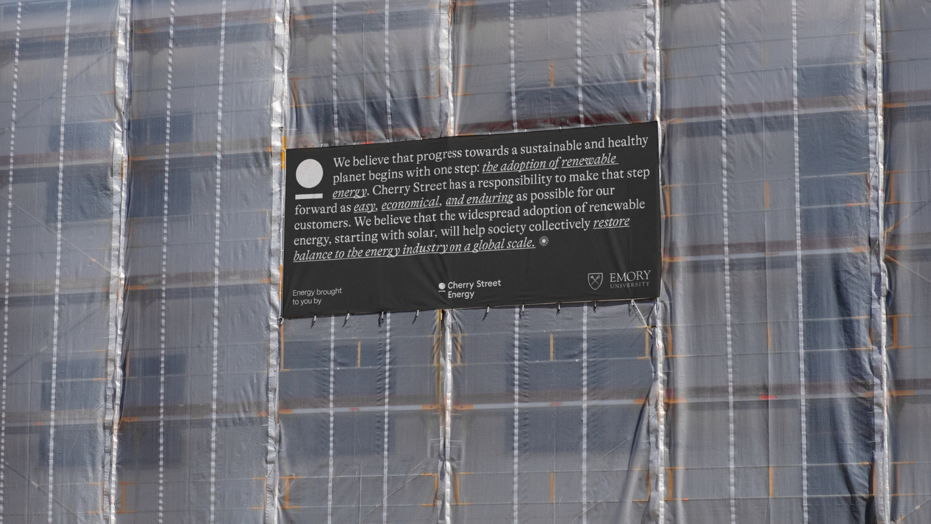
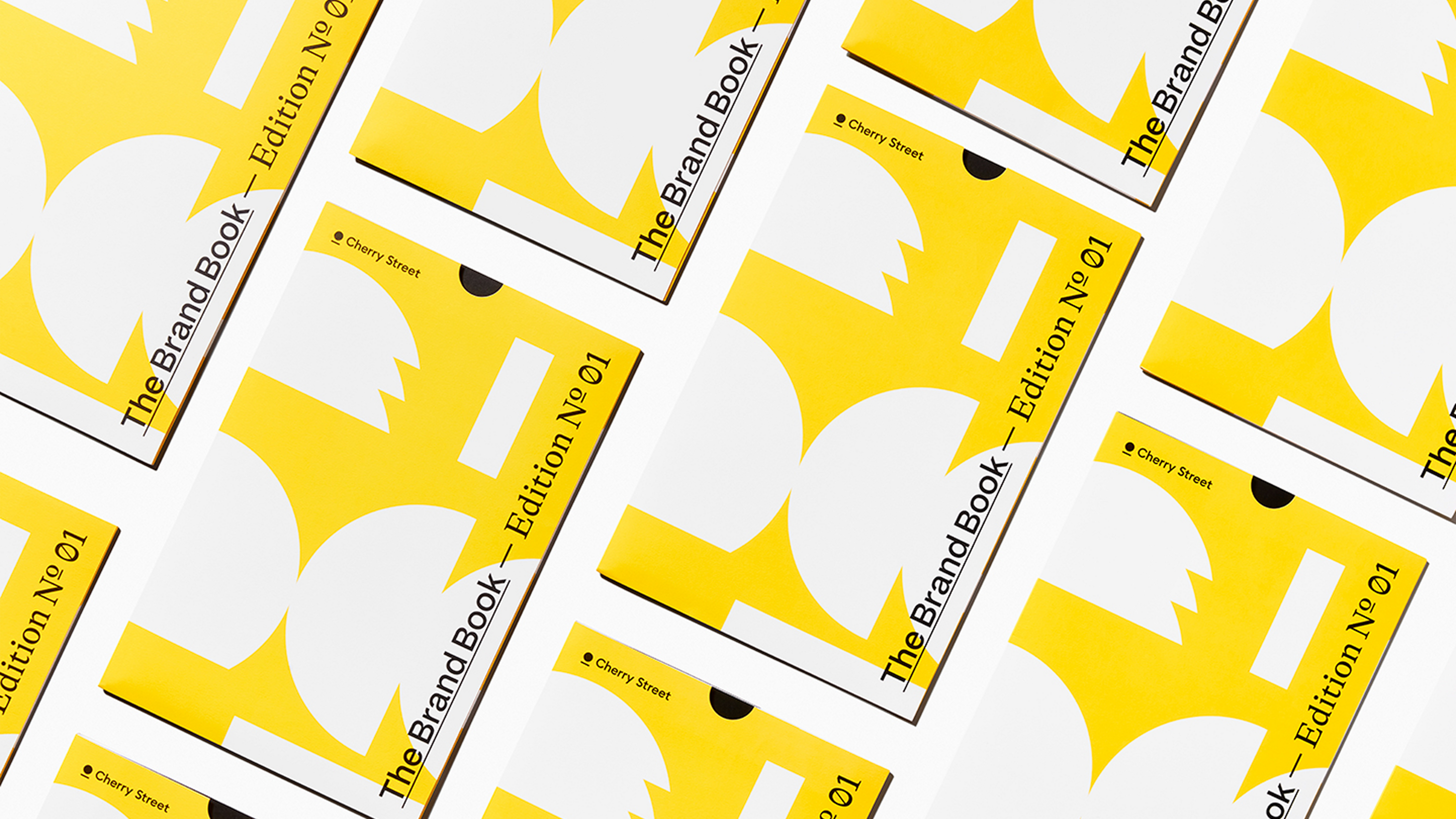
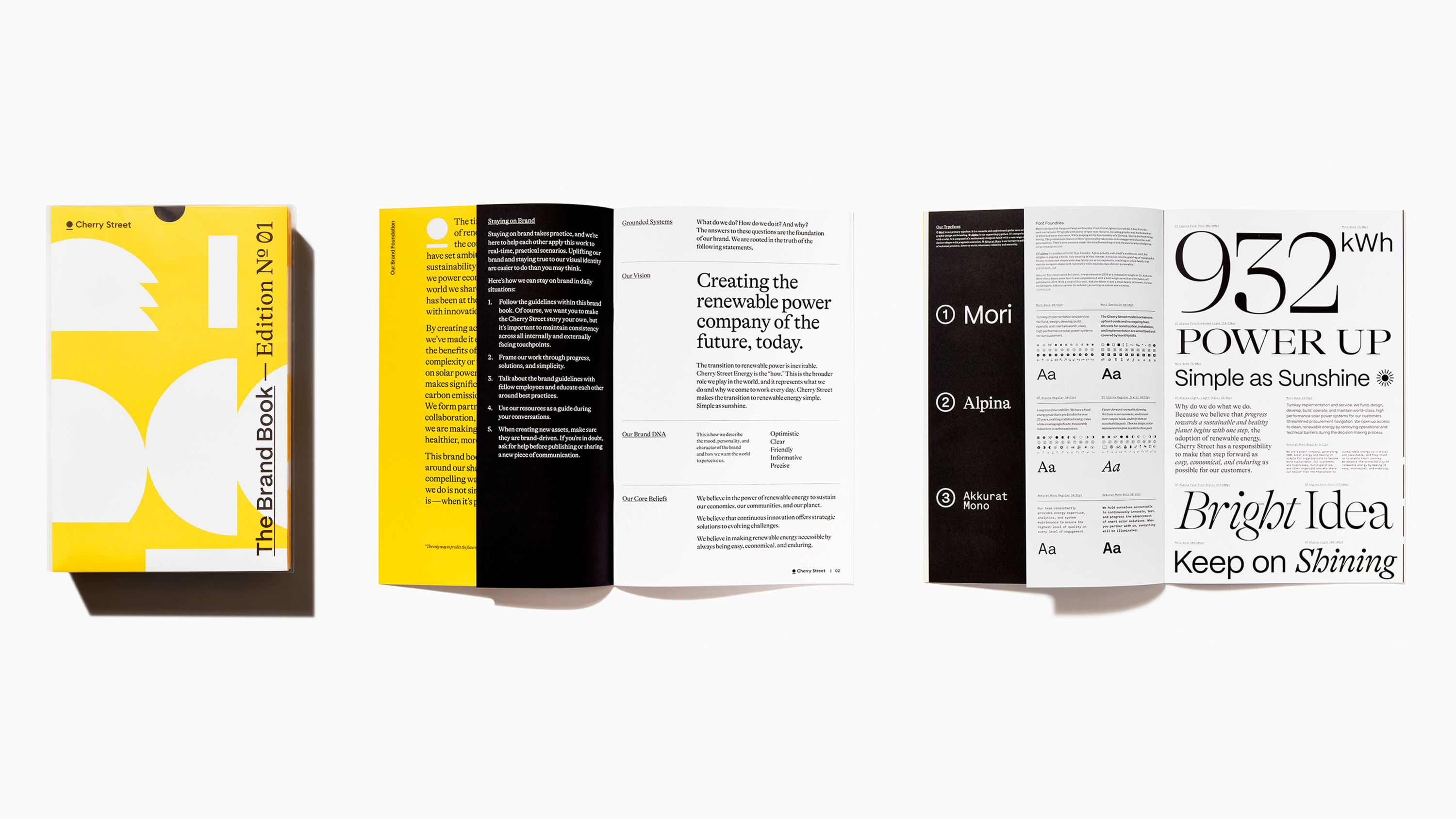
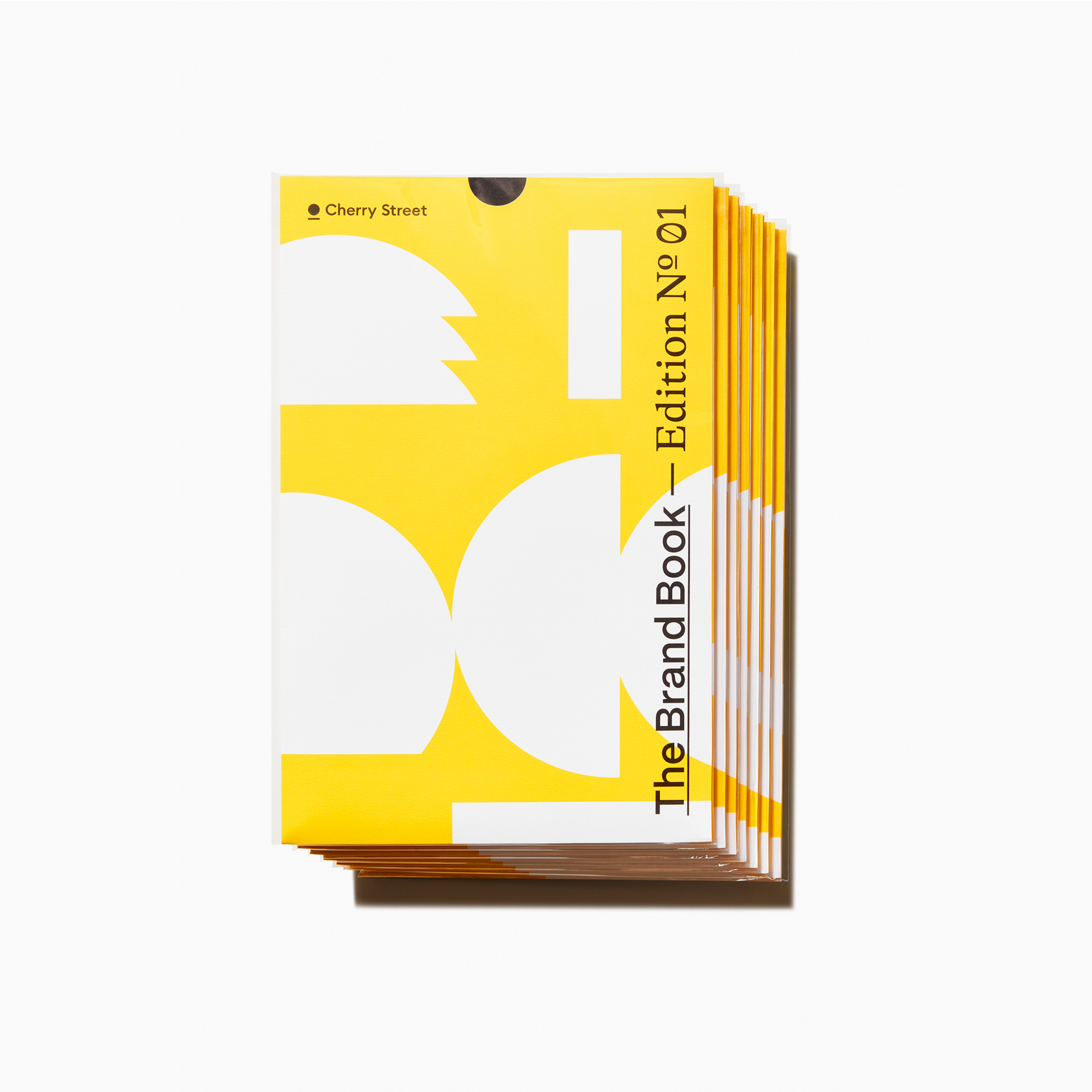
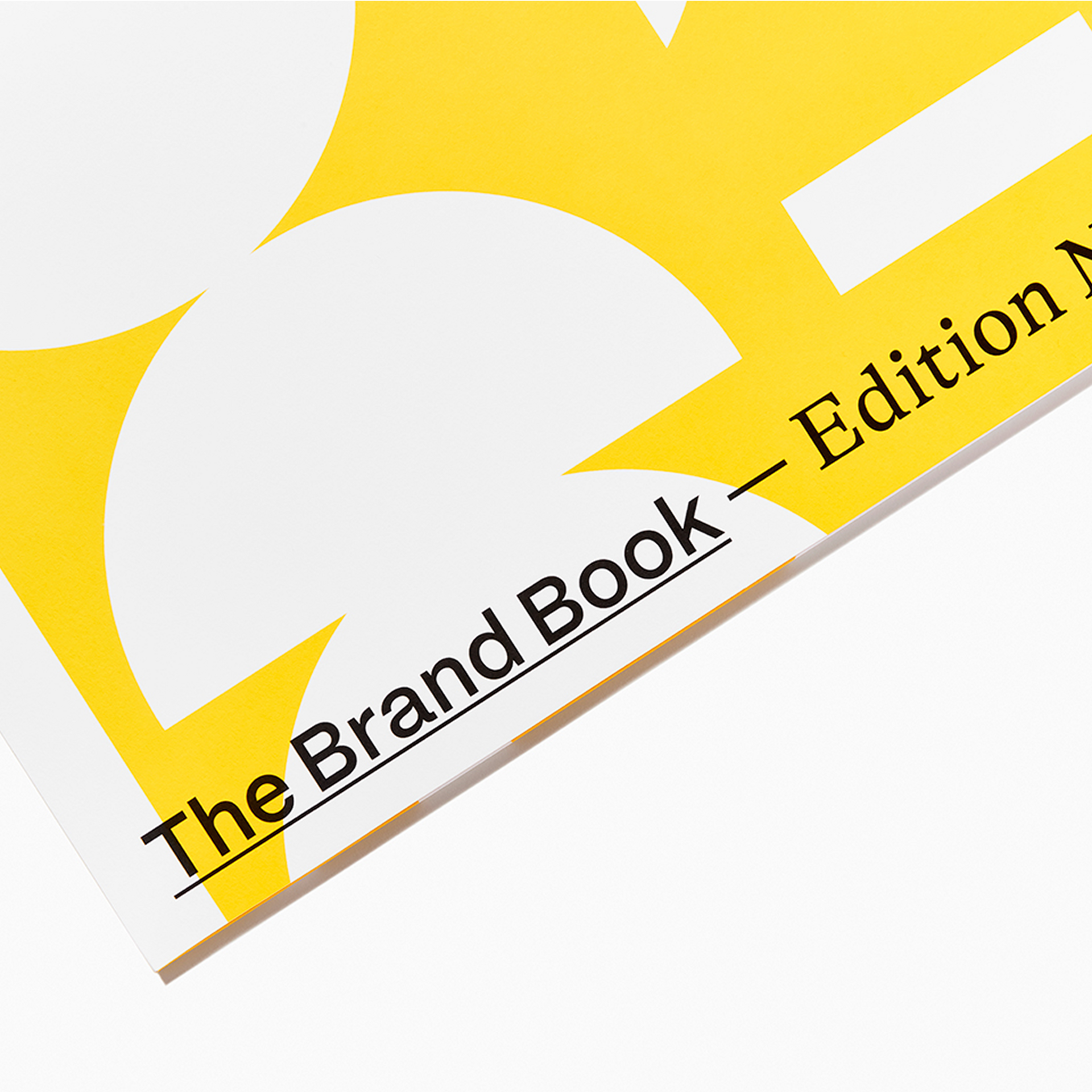
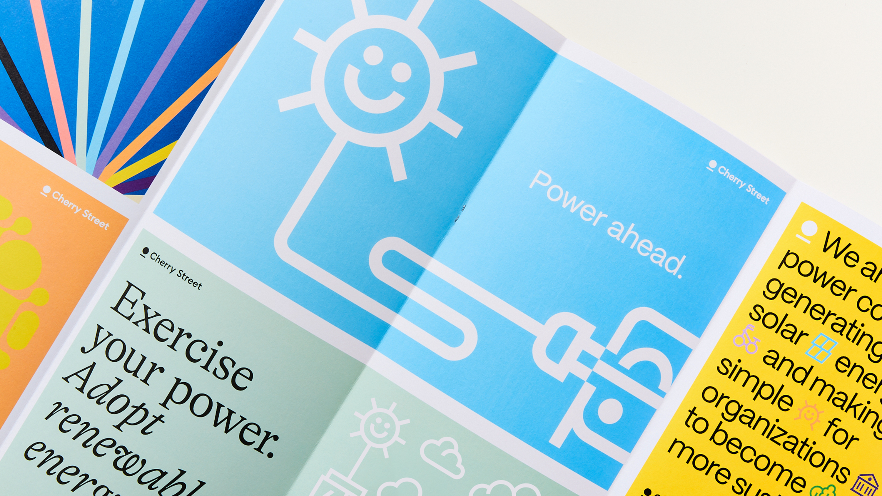
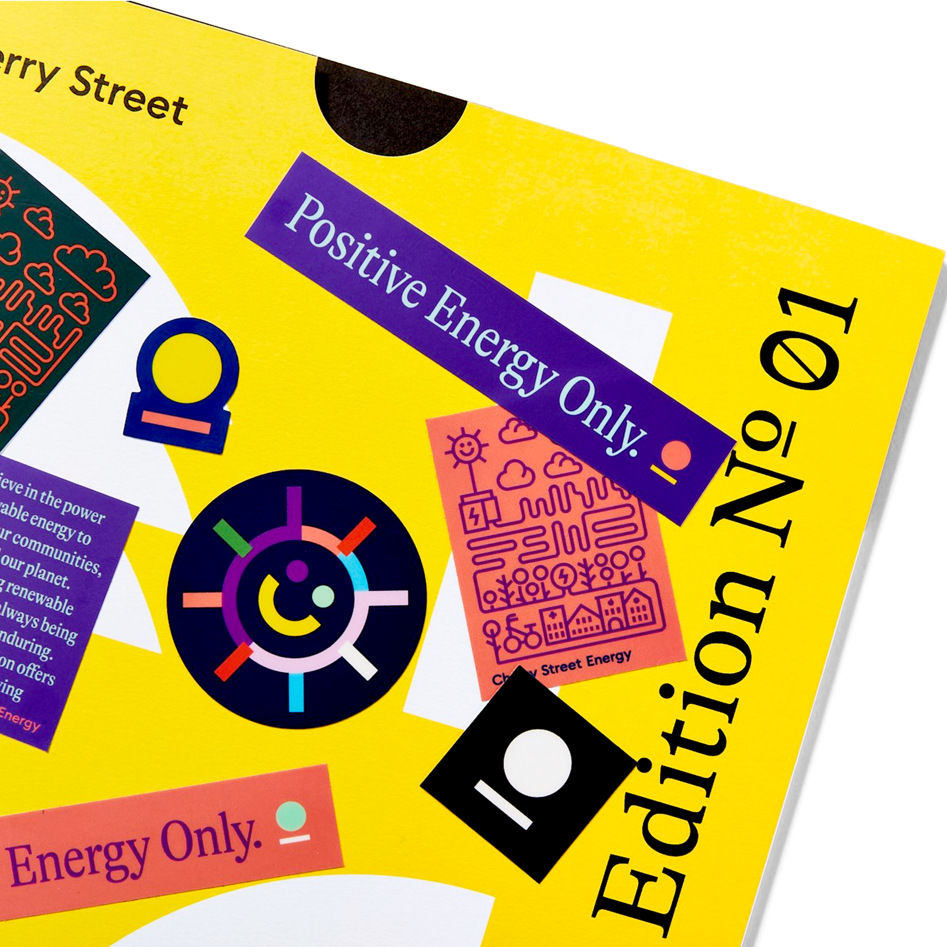
Brand Book
Deliverables
- Logo System
- Color Palette
- Typography System
- Naming
- Iconography
- Messaging Framework
- Brand Book
- Copywriting
- Animation
- Brand Launch Video
- Brand Launch Employee Experience
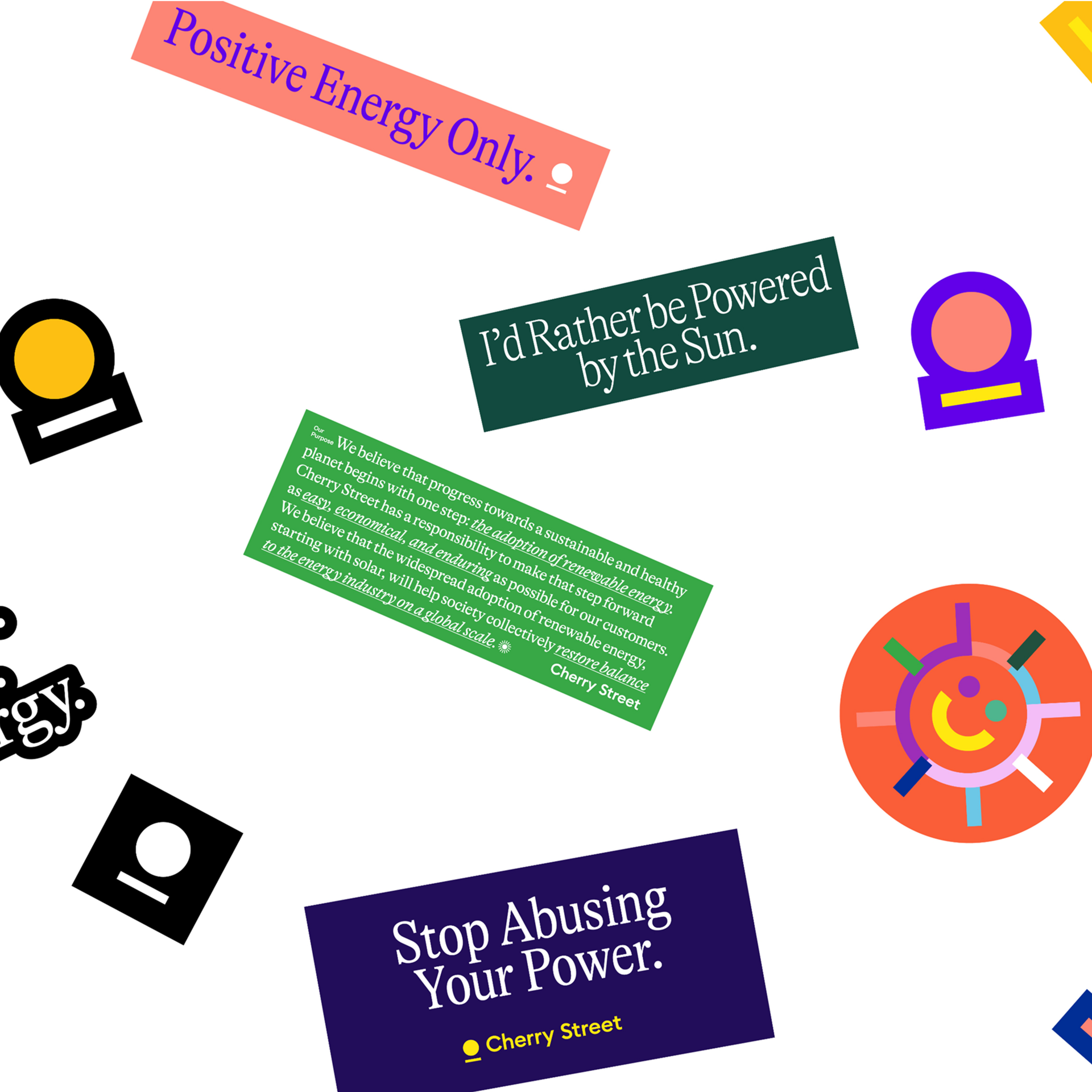
- Apparel & Brand Merchandise
- Client Cherry Street Energy
- Location Atlanta, GA
Visit the Website
www.cherrystreet.com